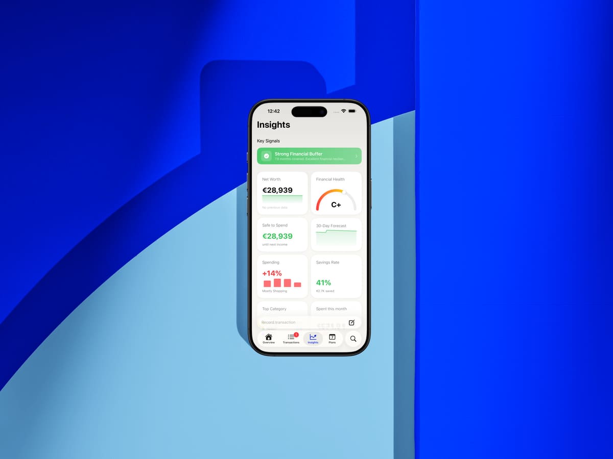
In today’s update we add a smarter financial buffer that tells you how many months of expenses you can cover, learning articles built right into the app, a redesigned paywall, a faster launch screen, a cleaner Face ID flow — and more.
Months of Safety — Not Just a Number
The financial buffer insight has been completely reimagined. Instead of showing a cash amount that’s hard to interpret, thrust now tells you how many months of expenses your savings can actually cover.
The calculation is based on your real spending over the last 90 days — not a guess — and the insight title and recommendation always reflect the zone you’re in, so you can tell at a glance how much breathing room you have.
If the buffer falls below one month, the insight is automatically promoted and surfaces at the top of your Insights list. For multi-currency setups everything is correctly converted to your base currency.
To see it, open Insights — the financial buffer card will be near the top, and its title alone tells you exactly where you stand right now.
Learning Built Into the App
thrust now has its own collection of finance articles, and you can read them without leaving the app.
Articles cover budgeting, cash flow, crypto, subscriptions, and more — written in plain language and updated regularly. Tapping an article opens it in a fast, native reader view that keeps you right inside thrust.
To read, open Settings and tap News & Education.
thrust Pro Upgrade Screen, Reimagined
The thrust Pro upgrade screen has been rebuilt from scratch. Features are now grouped by theme — privacy, AI, multi-currency, advanced reports — so you can actually see what you’re getting instead of scrolling through a wall of bullet points.
The weekly plan now appears correctly in the picker, prices load reliably on the very first launch, and the whole screen feels calmer and easier to read.
To open it, tap Upgrade to Pro anywhere in the app.
A Faster Launch Screen
The old grey skeleton that flashed before the app loaded has been replaced with a clean branded logo. Launching thrust now feels instant and on-brand from the very first moment.
Face ID, Updated
The Face ID unlock flow had a few rough edges that could leave you staring at a black screen after a failed scan. The whole flow has been reworked: cancel, fallback and retry all work the way you’d expect.
You can also now set an auto-lock timeout — choose how long thrust waits before requiring Face ID again.
To change it, open Settings → Security → Password and Face ID → Auto-Lock.
Faster, prettier categorization
The quick categorization carousel — where you sort uncategorized transactions with a single tap — has been completely redesigned. Cards are now full-width, categories sit in a colorful grid, and the steps glide smoothly instead of jumping. Sorting through your unsorted transactions feels lighter, faster and just nicer to use.
The gestures stay the same: swipe right to apply the suggested category, left to skip, shake to undo if you tapped too fast. Got 200 uncategorized transactions piled up? Give it five minutes.
Ghost Mode. When active, it blocks network access. Core tracking and analysis continue offline; live prices, downloads, and iCloud sync are unavailable.
A Livelier App
We’ve added motion to places that used to feel static — list reveals, sheet presentations, content swaps, headers that collapse as you scroll. Nothing that slows you down, just small moments that make the app feel more alive. If you prefer, everything respects Reduce Motion in iOS Settings.
Small Things You’ll Notice
- Every sheet across the app now uses the same close button in the same place. Small, but it adds up.
- The Done button in Daily Quests is now clearly readable on every background.
- The image cropper no longer overlaps the status bar on tall photos.
- List rows are crisp again — no more washed-out grey lines.
- Opening external links across the app is slightly snappier.
Privacy Improvements
When you copy a link from News & Education, the copied text now expires from your clipboard automatically, so sensitive material doesn’t linger.
Under the Hood
Crash fixes, performance improvements, and preparation for newer iPhones. Nothing you need to think about — but the app should feel just a little more solid everywhere.